

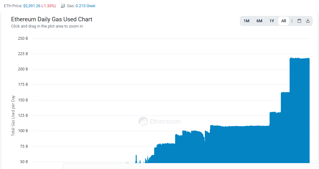
Ethereum’s daily gas used chart just hit an all-time high, above 200 billion units a day. That’s more than double the plateau near 100 billion earlier on the same chart. It’s a real usage record, not a price story. There’s a catch, though, and most Layer 2 teams are missing it.
Ethereum Usage Records Rarely Get Framed as News
A price all-time high gets covered automatically. A usage all-time high, more actual economic activity happening on the base chain, usually doesn’t, mostly because it’s a less visually dramatic number and takes more context to explain. That’s exactly the gap a Layer 2 team can fill with a well-timed, well-sourced pitch instead of leaving it to a chart nobody wrote a caption for.
The angle that actually works isn’t we’re on Ethereum, look how busy it is. It’s more specific: what a particular L2 sees in its own transaction volume during the same window, and whether that tracks with, lags behind, or diverges from the base-layer spike. Divergence, in particular, is a real story a reporter can’t get anywhere else.
Record Usage With Near-Zero Fees Changes the Pitch
Look at the header of that Etherscan screenshot. Gas sat at 0.213 Gwei. Ethereum handled record usage while a simple swap cost well under a dollar. Busy and expensive usually travel together. This time they didn’t.
That weakens the oldest Layer 2 pitch, we’re cheaper. The base layer itself now sells cents-level fees on the same day it sets a usage record. A team still leading with cost savings sounds like it hasn’t checked the number.
Base layer or Layer 2: what does one swap cost?
Change the gas price and the Layer 2 fee to see when a cost pitch still holds.
The 0.213 Gwei default is the gas price shown on Etherscan when the screenshot was taken. The swap size and Layer 2 fee are assumptions.
So what does a Layer 2 pitch lead with instead? Something a reporter can’t get from the base layer. A specific user base. A settlement partner. A product that only works at that speed. Cost savings can still show up, but only when gas spikes and the comparison flips in the Layer 2’s favor.
This overlaps with a similar dynamic in how restaking and LRT protocols pitch their own growth story, where the strongest angle ties a project’s own metrics to a specific, verifiable moment in the base chain’s activity rather than describing growth in the abstract.
A Founder Still Needs to Explain Why It Matters
A chart alone doesn’t sell the story. Someone who can explain, in plain terms, what a usage spike actually means for builders and users turns a data point into something a non-technical reporter can actually run. Without that translation, even a genuine record like this one just sits there as a number nobody outside crypto Twitter notices.
News Coverage Agency does this translation work daily for L2 and infrastructure clients, turning a raw usage chart into a story a mainstream reporter will actually run. Reach out to turn your own network’s numbers into real coverage.